If you’ve ever opened a website on your phone only to find yourself squinting at tiny text or frustrated by buttons that won’t click, you know the stakes. In 2026, a website that doesn’t “just work” on every device isn’t just a minor annoyance, it’s a major business liability.
Stepping into the world of web design and development can feel like wading through an ocean of jargon. Whether you are a small business owner or a marketing lead, the pressure to stay relevant in a mobile-first world is real. In this guide, you’ll learn exactly what responsive web design services include, how responsive web design layouts work, the key benefits of responsive web design for SEO and conversions, and how to choose a professional responsive web design company that aligns with your business goals in 2026 and beyond.
What Are Responsive Web Design Services?
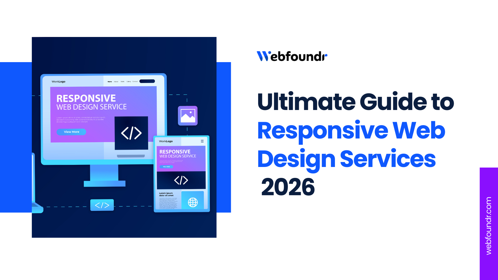
Responsive web design services create websites that automatically adjust layouts, images, and content to look perfect on any device screen size, from smartphones to large desktop monitors.
These professional web design services ensure a seamless mobile-friendly website design experience without users needing to pinch, zoom, or scroll horizontally. A responsive website design company builds sites that fluidly adapt across mobile phones (e.g., iPhone, Android), tablets (iPad, Galaxy Tab), desktops, and even large ultra-wide screens, delivering consistent branding and functionality everywhere.
Why Responsive Web Design Services Matter Now
In 2026, the way people browse the internet has completely shifted. Most users now discover, research, and buy from businesses on their smartphones first, not desktops. This shift toward mobile-first browsing has changed how websites are ranked and experienced.
Google now evaluates websites primarily based on their mobile performance, meaning non-responsive websites struggle with lower rankings, higher bounce rates, and missed conversion opportunities. If a site is difficult to navigate or read on a phone, users leave often within seconds and search engines take that as a clear signal of poor quality. Non-responsive sites suffer 67% higher bounce rates, slashing conversions.
That’s why businesses can no longer afford outdated or fixed-layout websites. A modern, mobile-friendly website design ensures consistent user experiences across devices while supporting responsive web design and SEO best practices such as faster load times, better Core Web Vitals, and improved engagement metrics.
Pro Tip:
Professional responsive web design services boost SEO with faster load times, stronger Core Web Vitals, and better user engagement. With Webfoundr, responsive design is paired with fully managed IT services including best SEO-optimized hosting, performance tuning, security, and maintenance so you get a high-performing, SEO-ready website without the technical hassle.
How Responsive Web Design Works
Understanding the “how” behind responsive web design services doesn’t require a degree in computer science. Think of a responsive website like water: when you pour water into a cup, it becomes the cup; when you pour it into a bottle, it becomes the bottle.
To achieve this “fluidity,” a responsive web design agency uses four core components that work together behind the scenes to ensure your website remains easy to use, fast, and visually consistent on every device without requiring you to understand complex code.
Core Components of a Responsive Web Design
1. Fluid Grid Layouts
In the past, websites were built with “fixed” layouts, meaning they were a specific number of pixels wide. If your screen was smaller than that width, you had to scroll sideways. Modern professional web design services use fluid grids. In a responsive web design layout, we define the width of elements in percentages (%) rather than pixels. This allows the layout to expand or contract like an accordion to fit the container it’s placed in.
2. Flexible Images & Media
Nothing ruins a mobile-friendly website design faster than an image that is too large for the screen, forcing the user to zoom out. At Webfoundr, we use “flexible media” that scale automatically to fit their containers, preventing layout breaks or slow loading. We code images and videos with a maximum width of 100%. This ensures that as the “fluid grid” gets smaller, the images scale down automatically without losing their aspect ratio or overlapping your text.
3. CSS Media Queries
If the fluid grid is the body, CSS media queries are the brain. These are small snippets of code that “ask” the device a question, such as: “How wide is this screen?” CSS media queries apply targeted styles based on screen size, like switching from multi-column to single-column views.This logic is the secret to high-performing responsive website design and search engine optimization, as it delivers the right code to the right device at the right time.
4. Mobile-First Approach
Mobile-first approach designs for small screens first, then layers enhancements for larger ones Google’s preferred strategy. Most responsive web design company experts today utilize a mobile-first web design strategy. Instead of designing a complex desktop site and trying to “shrink” it down (which often leads to a cluttered mobile experience), we start with the mobile version.
What’s Included in Professional Responsive Web Design Services?

Professional responsive web design services go beyond basic layouts, delivering a complete package that ensures your site performs flawlessly across all devices while driving business results. A top-tier responsive web design company ensures that your site is technically sound, user-centric, and ready to convert visitors on any device.
At Webfoundr, we include these critical elements as standard pillars in our service stack:
1. UX/UI Design for Every Interaction
We don’t just “shrink” your desktop site. Our responsive web design agency creates custom User Experience (UX) and User Interface (UI) strategies that account for how people actually hold their devices. This means larger, “thumb-friendly” buttons on mobile and sophisticated, immersive layouts for desktop users.
2. Mobile-First Wireframing
We begin the blueprinting process with mobile-first web design. By wireframing the mobile version first, we force a focus on your most essential content and calls-to-action (CTAs). This ensures that your most important message is never buried under decorative elements when screen space is limited.
3. Rigorous Cross-Device Testing
A site that works on an iPhone 15 might break on a Samsung Fold or a vertical monitor. Our responsive web design services include QA testing across dozens of real-world devices, browsers, and screen resolutions to guarantee a flawless experience for 100% of your audience.
4. Performance Optimization (Core Web Vitals)
In 2026, speed is a ranking factor. We optimize every site for Core Web Vitals, focusing on metrics like Interaction to Next Paint (INP). By using next-gen image formats (AVIF/WebP) and minifying code, Webfoundr ensures your site loads in the blink of an eye, even on slower mobile networks.
5. SEO-Friendly Structure
Responsive website design and search engine optimization go hand-in-hand. We build your site with a clean, semantic HTML structure that helps AI search bots understand your hierarchy. From schema markup to optimized URL structures, we ensure your site is “crawl-ready” from day one.
6. Seamless CMS Integration
You should be able to update your site without calling a developer. We integrate your design into user-friendly Content Management Systems (CMS) like WordPress ensuring that the responsive web design layout remains perfectly intact no matter what new content you add.
7. Ongoing Support & Maintenance
The digital world moves fast. New devices and browser updates launch every month. Webfoundr provides ongoing maintenance to ensure your responsive web design seo and technical performance stay ahead of the curve, keeping your site secure and functional long after launch.
Key Benefits of Professional Responsive Web Design Services
Choosing professional responsive web design services is an investment that pays dividends across every department of your business from marketing to customer support. If you are feeling overwhelmed by the technicalities, remember that the goal is simple: making it as easy as possible for your customers to buy from you, no matter what device they are holding.
Here is how a responsive website design company helps solve your biggest digital pain points:
1. Better User Experience Across Devices
A responsive website ensures visitors enjoy a seamless experience whether they’re on a desktop, tablet, or smartphone. Webfoundr’s responsive web design services prioritize usability, intuitive navigation, and fast load times, keeping users engaged and reducing bounce rates. The primary goal of our responsive web design layout is consistency.
2. Improved SEO Rankings via Better UX Signals
Responsive web design and search engine optimization are two sides of the same coin. Responsive sites excel in Google’s mobile-first indexing with superior speed and low bounce rates. Because they use a single URL, making it easier for their AI bots to crawl and index your content. By implementing a SEO-friendly responsive design, Webfoundr helps your website achieve higher rankings, as Google interprets smooth navigation, fast loading, and mobile-friendliness as strong signals.
3. Higher Conversions
A mobile-friendly site is a high-converting site. With Webfoundr’s responsive web design services, clients often see a 15–20% increase in mobile conversions. Optimized buttons like “Buy Now” or “Contact Us” are placed in the “thumb zone” for easy clicking. Forms are streamlined for mobile users, reducing the friction that usually leads to abandoned carts.
4. Future-Proof Scalability for New Devices
The “Internet of Things” (IoT) is expanding. Between 2024 and 2026, we’ve seen a surge in foldable phones, smart watches, and even smart refrigerators with web browsers. A responsive web design company with SEO expertise builds your site on a fluid foundation that scales to devices that haven’t even been invented yet, saving you from a total redesign every time a new gadget hits the market.
5. Reduced Development and Maintenance Costs
Maintaining separate websites for desktop and mobile can be expensive. A single responsive website reduces development time, simplifies updates, and lowers long-term maintenance costs, making it a cost-effective solution. At Webfoundr, you only pay for one set of responsive web design services, one hosting plan, and one marketing strategy. When you want to change a price or update a blog post, you do it once, and it reflects everywhere instantly. This reduces long-term management costs by nearly 50%.
6. Enhanced Brand Trust with Seamless Experiences
First impressions are everything. A broken or non-responsive layout screams “outdated” and can make users question your security and professionalism. A seamless, high-performance experience across all platforms tells your customers that you are a modern, reliable, and detail-oriented brand. Professional responsive web design services from Webfoundr help strengthen your brand credibility by ensuring your site works flawlessly across all platforms.
Get Quote from Best Responsive Web Design Agency
With Webfoundr, these benefits come as part of a comprehensive responsive web design service that not only enhances your website’s performance but also drives measurable business results.
How to Choose the Right Responsive Web Design Company
Selecting the right partner for responsive web design services is a high-stakes decision. In 2026, the gap between a “standard” website and a high-performance, AI-ready platform is wider than ever. To ensure you’re investing in a solution that grows with your business, you need to look beyond the surface-level aesthetics.
If you’re still narrowing down your options, check out our deep dive: How to Choose the Best Responsive Website Design Agency. In the meantime, here is a professional checklist to guide your vetting process.
1. Portfolio & Case Studies
Reviewing a responsive web design company’s portfolio and case studies provides insight into their experience and design quality. Look for examples of responsive websites they’ve built, particularly projects that align with your industry and goals.
2. Mobile-First Expertise
A strong responsive web design company prioritizes mobile-first design, ensuring your website performs flawlessly on smartphones and tablets before scaling up to larger screens. This approach enhances usability and engagement for all users.
3. SEO Understanding
The best responsive web design company should understand SEO-friendly website structures, page speed optimization, and other technical elements that boost search engine rankings while delivering an excellent user experience.
4. Performance Optimization
Ensure your chosen responsive web design agency has a track record of optimizing website performance, including loading speed, image optimization, and smooth functionality across devices.
5. Post-Launch Support
Look for the best responsive web design and development company that offers ongoing website support and maintenance, keeping your site secure, up-to-date, and adaptable to future changes.
Responsive Web Design Services vs. Other Design Approaches
In 2026, choosing the right development strategy isn’t just about how a site looks; it’s about how it handles the “chaos” of the modern device landscape. While there are several ways to make a site accessible on mobile, responsive web design services remain the gold standard for most businesses due to their balance of flexibility and SEO value.
Responsive vs. Adaptive Web Design
This is the most common comparison in the industry. Think of Responsive Design as a liquid that fills any container perfectly, while Adaptive Design is more like a set of specialized suits, one for a child, one for an adult, and one for a giant.
Feature | Responsive Web Design (Liquid) | Adaptive Web Design (Fixed Kits) |
Flexibility | Infinite. Fits every screen size instantly. | Limited. Only fits specific “breakpoints.” |
Performance | Great when optimized (uses one codebase). | Potentially faster (loads only device-specific assets). |
Cost | Lower. One build, one maintenance cycle. | Higher. Requires designing 3-6 separate versions. |
Maintenance | Simple. Update content once; it reflects everywhere. | Complex. Each version must be updated separately. |
AI/SEO Value | High. Preferred by Google for single-URL indexing. | Moderate. Can confuse AI crawlers if content differs. |
Responsive vs. Mobile-Friendly Websites
You might hear people say, “My site is already mobile-friendly.” In 2026, “mobile-friendly” is no longer enough. Mobile-Friendly usually means a desktop site that has been “shrunk” so it’s readable on a phone. It often results in tiny buttons, zoomed-out text, and frustrating navigation.
Responsive website layout is a mobile-first approach where the site is rebuilt to thrive on touchscreens. It includes “thumb-zone” navigation, where the most important buttons are at the bottom of the screen for easy one-handed use.
Who Needs Responsive Web Design Services?
In 2026, the question isn’t if you need a responsive site, but how fast you can implement one before losing your edge. With mobile devices now driving over 59% of global e-commerce transactions, “responsive” has moved from a feature to a fundamental requirement for survival.
At Webfoundr, we specialize in tailoring responsive web design services to the unique needs of different industries. Here is a breakdown of who benefits most from a modern, fluid approach:
1. Small & Medium Businesses
For growing businesses, a responsive mobile-friendly website ensures that customers can easily access your services on any device. This enhances credibility, increases engagement, and drives more leads without the need for multiple site versions.
2. E-Commerce Brands
Online stores rely on smooth, mobile-optimized experiences to convert visitors into buyers. Responsive web design services help e-commerce brands deliver consistent product browsing, faster checkout, and higher conversion rates across all devices.
3. SaaS Companies
Software-as-a-Service platforms need responsive websites to showcase features, support complex data dashboards, and provide intuitive user experiences. Webfoundr responsive web design services use CSS Container Queries to ensure your complex features adapt intelligently,and your web apps and landing pages work seamlessly for all users.
4. Startups
New businesses who can’t afford to build and maintain separate apps and websites can benefit from responsive web design layout, enabling them to launch a scalable website that adapts to future devices. This approach saves time and development costs while building a professional online presence from day one.
5. Service-Based Businesses
From consultants and lawyers to agencies and healthcare providers, service-oriented companies need websites that clearly communicate offerings and encourage appointments. A polished, mobile-first responsive web design showcases your expertise and makes booking appointments effortless for busy clients increasing trust and client acquisition.
6. Enterprises & Corporate Websites
Large organizations require websites that cater to diverse audiences and devices. Professional responsive web design services provide a unified, organized deep content architecture into clean, accessible menus that strengthens brand consistency, improves accessibility, and supports global reach.
Get a Responsive Web Design Quote Today
At Webfoundr, our responsive web design services are tailored to meet the unique needs of all these business types, ensuring every visitor has a seamless, engaging, and conversion-focused experience.
Why Choose Webfoundr for Responsive Web Design Services?
Most companies offering responsive web design services stop once the website is launched. Webfoundr stands apart by treating your website as a high-performance business asset. We distinguish ourselves from traditional web design companies in the USA by acting as a “hybrid” provider merging high-end creative design with fully managed IT infrastructure and ongoing digital marketing.
When you partner with us for responsive web design services, you aren’t just getting a one-time project; you’re gaining a comprehensive partner for digital growth. Our 2026 service stack includes everything from AI-driven UX testing to a specialized responsive web design company with SEO expertise that puts your brand in front of the right audience.
1. A "Fully Managed" All-in-One Approach
Most companies build a site and hand it over, leaving you to find hosting and tech support elsewhere. Webfoundr eliminates “vendor sprawl” by bundling responsive web design with hosting, maintenance, security, and 24/7 technical support.
- Web Development + IT Support: We package our designs with premium hosting, security, and 24/7 technical support.
- One Partner, Zero Stress: Small businesses can stop juggling multiple logins and invoices for hosting, design, and IT. We handle it all under one roof.
2. Conversion-Driven & Tech-Focused
Webfoundr doesn’t just build sites that look good; we build “conversion-driven systems.”
- Built for Growth: Every responsive web design layout we create is engineered to turn visitors into customers through strategic SEO, lightning-fast load times, and intuitive calls-to-action (CTAs).
- No Generic Templates: We emphasize bespoke, tailored websites. Your brand is unique, and your mobile-friendly website design should be too.
3. Enterprise-Level Security and Performance
As a responsive web design company with SEO expertise, we know that security is a vital part of user trust and SEO. While others simply install a plugin, Webfoundr provides enterprise-grade measures:
- Proactive Protection: Our services include advanced firewalls, real-time malware scanning, DDoS mitigation, and daily backups.
- High-Performance Hosting: Our infrastructure is optimized specifically for speed, ensuring your professional web design services are backed by the fastest server response times available.
4. Performance-First Creativity
At Webfoundr, we believe a beautiful design is only successful if it loads instantly. We blend cutting-edge aesthetics with “lightweight” coding practices. By focusing on Core Web Vitals and 2026 speed standards, we ensure your responsive web design layout isn’t just visually stunning, it’s lightning-fast.
5. Experience That Delivers Results
We bring years of expertise as a responsive web design company with SEO expertise. We’ve helped businesses across various sectors from e-commerce to SaaS, see a measurable uplift in their mobile engagement. Our team understands the nuances of user behavior, ensuring that your calls-to-action are always in the “sweet spot” for thumb-based navigation.
6. Predictable, Subscription-Based Costs
We believe high-end responsive web design services should be accessible. Unlike traditional agencies that charge massive, one-time upfront fees, Webfoundr uses a transparent subscription model. This allows small businesses and startups to access elite design and IT support with predictable monthly costs.
7. SEO-Optimized & AI-Ready for the Future
We integrate responsive website design and search engine optimization into the very DNA of your project. We ensure your site uses clean, semantic code that AI chatbots love to scrape and structured data that wins Google’s “Featured Snippets.” With Webfoundr, your site is “crawl-ready” and optimized for the AI-driven search landscape of 2026.
FAQ
1. What is responsive web design?
Responsive web design is a development approach that allows a website’s layout, images, and navigation to automatically adjust based on the user’s screen size and orientation. By using fluid grids and CSS media queries, a responsive web design agency ensures that one single website provides an optimal experience on everything from a smartphone to a desktop monitor.
2. Are responsive websites better for SEO?
Yes, absolutely. Responsive web design and search engine optimization are deeply connected. Google recommends responsive design because it uses a single URL and one set of HTML code, making it easier for search bots to crawl and index your content. Furthermore, responsive sites typically have lower bounce rates and faster load times—key factors in Google’s 2026 Core Web Vitals rankings.
3. How long does responsive web design take?
The timeline for professional web design services depends on the complexity of the project. A basic responsive site (5–8 pages) typically takes 4 to 6 weeks from discovery to launch. More complex e-commerce platforms or enterprise-level systems with custom integrations can take 3 to 5 months. At Webfoundr, our “mobile-first” workflow streamlines this process to ensure a fast, efficient rollout.
4. Do responsive websites work on all devices?
Yes. A well-coded responsive web design layout is “device-agnostic.” This means it is built to work on any device with a web browser, including iPhones, Androids, tablets, laptops, foldable phones, and even smart TVs. Because the design is fluid rather than fixed, it is future-proofed for new devices released later in 2026 and beyond.
5. Can an existing website be made responsive?
In most cases, yes. However, “retrofitting” an old, rigid website can sometimes be more expensive and less effective than a fresh build. If your current site uses outdated code, a responsive web design company may recommend a “re-theme” or a total rebuild to ensure you benefit from modern speed optimizations and enterprise-grade security.
6. What’s the difference between responsive and adaptive design?
The main difference is fluidity. Responsive web design is fluid; the content flows like water to fit any screen width perfectly. Adaptive design uses “static” layouts that only snap into place at specific sizes (breakpoints). Responsive design is generally preferred by modern developers because it is easier to maintain and offers a more consistent experience across the infinite variety of screens available today.
Ready to Transform Your Digital Presence?
Don’t let a non-responsive website hold your business back. Whether you’re looking to refresh an aging site or build a groundbreaking new platform, the experts at Webfoundr are here to help you navigate the future of the web.